This problem occurs using NetLogo 7.0.3 on a MacBook Pro running Sequoia 15.3.
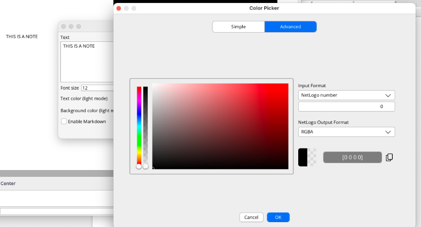
When changing the background color of a note widget, if you switch from Advanced color-editing mode to Simple, the transparency is reset to zero. This happens both with the light and dark background editors.
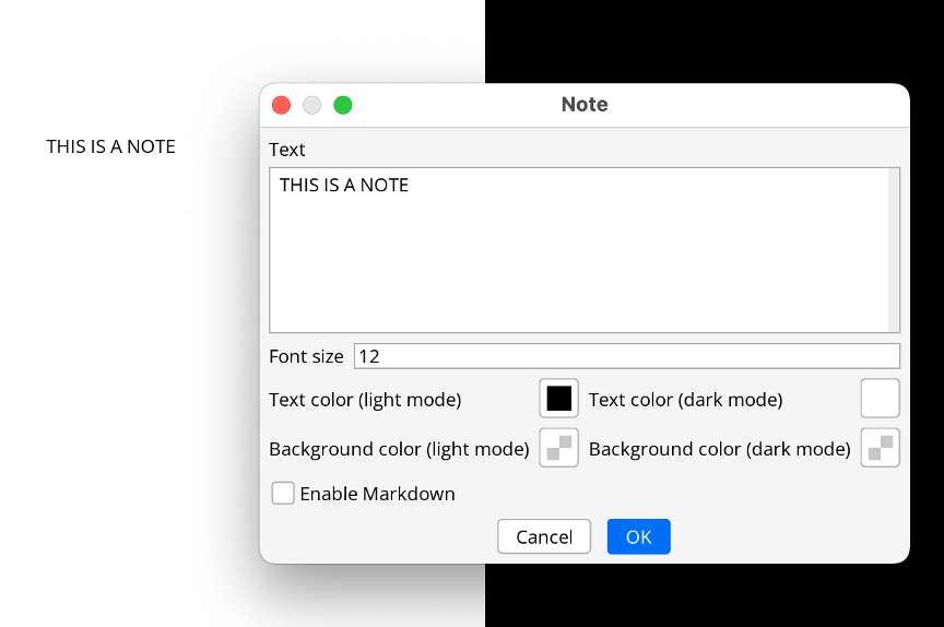
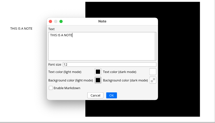
Here is the step-by-step reproducible bug with screenshots. Start by creating or editing the note.
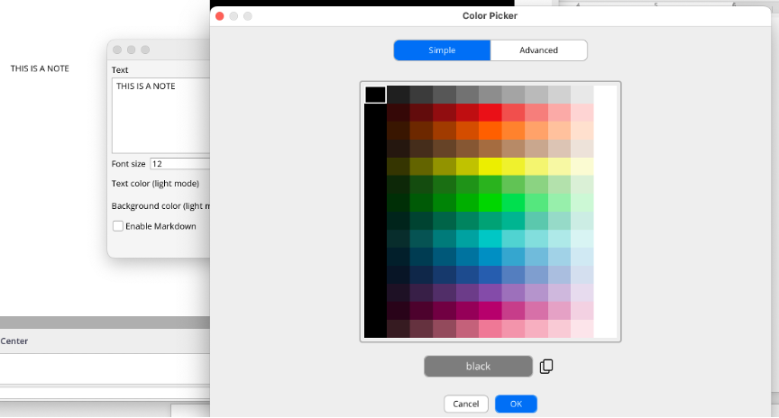
Thank you for the report! However, this is the expected behavior. The two tabs in the Color Picker are not just different representations of the same color spectrum, but rather two completely separate color spectrums. Although the Advanced tab allows you to select colors from the full RGBA spectrum, the Simple tab only allows you to select NetLogo colors, which cover a more limited subset of the full spectrum and cannot have any transparency. Details about this color spectrum can be found here. Let us know if you have any other questions or suggestions for improvements!
I understand that they are different color spectrums, but if I simply switch from Advanced to Simple and back to Advanced without touching anything, that should not change the color that I get in the Advanced tab - but it does. That’s either a bug, because it is changing a color without me doing anything, or you should label it something other than “advanced” and “simple” and not make it look like it’s simply like switching editing mode.
In my opinion, although from your perspective they are coded as different spectrums, from the end-user perspective that makes no sense: I am doing what should be a no-op (switching between two tabs or two modalities) and it’s changing colors on me…
In any case, it’s not a big deal normally. It so happens that I have been playing with note colors, and this was a bit annoying.
Thank you for clarifying, I see how that could be confusing. I’m still not entirely sure that it’s a bug, but it’s definitely worth some further thought. One issue that crosses my mind is the case where you select a transparent color in the Advanced tab, then switch to the Simple tab and select a new color from there. If the transparency is preserved, then you would end up with an RGBA color, despite having actively selected a NetLogo color. I could see the argument to preserve transparency as long as a new color is not selected, although it still could result in a slight inconsistency. It might be a bit confusing to see a NetLogo color selected and displayed in the Simple tab, but get an invisible color after closing the dialog due to transparency that was carried over from the Advanced tab. I’m happy to hear any thoughts you have on these issues!
Thank you for the clarification. I just played with it a lot more, re-read the relevant manual portions (both on the color picker and on widgets), and I have some suggestions. Please feel free to ignore
I think there are several separate issues to consider.
Standard UX practice if you have advanced features it to start with the simple tab. This happens when I open the color picker from the Tools menu, or if I click the color picker to select the text color in a note edit popup, But if I click the background color selector in the note edit popup it, the picker opens in the “Advanced” tab. I suspect this is keeping with the default behavior from earlier versions of NL, which by default had the “transparency” checked, but in this version that creates significant confusion.
To add to the confusion, if I create a note, by default it is transparent, and the background color editor opens on the Advanced mode. But if I then change it to an opaque color (on purpose or by accident) and click OK, when I then click the background color editor again, it now opens in the Simple mode.
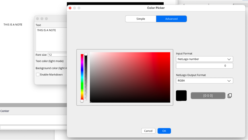
If I am using a color format that allows transparency, and temporarily switch to the Simple tab, when I switch back to the Advanced tab I would expect my transparency level to be where it was before, not to have been changed to zero. Incidentally, I just realized that this also happens if I switch the output color format in the NetLogo Output Format drop-down from RGBA to NL number. This, too, does not seem reasonable.
On a related note, although I see it in the documentation, I don’t understand why, if the output mode selector is on RGBA and I drop the transparency to 0 you remove the last number - effectively changing RGBA to RGB even though the drop-down still says RGB. It would seem more logical to leave the fourth number and simply set it to zero.
Separately, the rounded square icon you use to show the regular and transparent colors is very confusing when transparency is off because you can’t really tell it’s supposed to be two parts. I would suggest separating that into two distinct parts and labeling them. Or at least leave a gap between the two sides.
I personally also find the output part to be confusing. The first time I opened the picker, not having read the relevant manual section, I could not figure out what the heck was the difference between “input” and “output”. These are not really input and output - and if I understand correctly, the only purpose of the “output” portion is to allow me to copy out the value. Does it do anything else meaningful? Is this really worth having here, and made to appear to have equal importance to the input?
My suggestions would be:
When the color picker is open and I am in the Advanced tab and I am viewing one of the color modes that allow transparency, the transparency level should be stored in a variable that is preserved until I actually save by clicking OK. If I then change color format or switch to the Simple tab, and then back, my transparency level should go back to where it was. If I don’t want transparency, I can then actively remove it.
In both tabs, add a transparency checkbox similar to older versions. If that box is checked, you would see the following:
In the Simple tab, a two-part color swatch that shows the non-transparent and transparent versions. If you uncheck the box, the transparent version should become grayed out or disabled or even disappear, but if I check the box again it should return to where it was.
In the advanced tab, if I check the transparency box, you should only enable input drop-down formats that allow transparency (RGBA, HSBA, HSLA, and four-digit hex). If I uncheck it, you ONLY show me those that don’t allow transparency (NetLogo Number, name, RGB, HSB, HSL, 3-digit hex), and you also either gray out or remove the vertical transparence slider. Also, if I then check the transparence box back on, you put the transparency level where it was when I unchecked it
Always open the picker in Simple mode. If it’s a new note, have the box checked (so it’s transparent if that’s the default you want).
If output is set to RGBA then alway show all four numbers even if I temporarily set A=0
For situations when the color picker cannot allow transparency (which right now I believe is only for the plot pens), disable the transparency checkbox, and either gray it out (preferred) or remove it completely. This should happen in both Simple and Advanced tabs, and behavior should be as suggested above.
Change the name of the two sections from input and output to something more meaningful - like “Manual entry” and “Copy color”. The latter should be visually separate and subordinate to make it clear that it has no functional impact on what you are doing. Maybe instead of an Output Format chooser, put a line below the swatch and color “output” with a radio-button with the three options all visible, and gray out the ones that are contextually not available.
I really appreciate the thorough and thoughtful comments, they will definitely not be ignored! Here are my thoughts on the issues you mentioned:
The default tab for the color picker is always Simple, unless the currently selected color cannot be represented on the Simple tab. If in the example you described, when the selected color had transparency, the color picker needed to open to the Advanced tab. If it always opened to the Simple tab, it would be more difficult to quickly adjust a color that had originally been created on the Advanced tab.
I understand the confusion with Input and Output formats; maybe we could improve the documentation. The Output format is not only for copying, it generally applies to the result of the dialog itself. For example, if you select NetLogo Number for the Output format, it will pick the closest NetLogo Number to return from the dialog when you press OK. This allows you to get a result from the spectrum you want while still being able to specify a color in the way that makes the most sense for you. Given this, it would not be correct to say that it has no functional impact on what you are doing, so I think the current dialog layout makes sense. We can certainly be more clear about that in the color picker documentation, though! Similarly, the Input format allows you to copy colors into NetLogo from a variety of common sources in NetLogo, other applications, and websites. It seems like maybe that caused some confusion because it wasn’t useful for you, so we could consider moving it to a slightly more hidden location. But it is the Advanced tab, so it seems reasonable to me to have advanced or specific features on it.
I agree with your comments about RGBA changing to RGB and the rounded square icons being too close together. We will try to improve these in a future release of NetLogo.
I strongly disagree with your suggestion to add transparency to the Simple tab, because it is intended for backwards compatibility with historical NetLogo numbers, which cannot represent transparency. We don’t want to give users the impression that they can use transparency in contexts where they cannot, which is currently every context except for note widgets.
Sorry to be a bit of a broken record on some of these issues, it just seems to me that the dialog has the correct behavior, but it was not intuitive at first. So I think the best path forward for each of these issues is to find ways to make the dialog easier to understand or more well-documented, rather than changing the underlying behavior. The current color picker is a very new addition to NetLogo, so it will take some time to refine it. Thank you again for the input, it is helpful for us to know which things could be improved!
OK, that’s fair, but I would like to point out that I am really confused by your last bullet point in which you say "We don’t want to give users the impression that they can use transparency in contexts where they cannot, which is currently every context except for note widgets”
According the user manual, transparency is available for turtles, links, labels and patches (in 3D, the A value is ignored in 2D). There are only three widgets that use the color picker: notes, input (when set to “color”) and plots. The manual states that “Transparency is not supported for the Color Input in this release, but may be available in the future.” Hence right now transparency is already available for the majority of situations in which you would use a color picker, and in the future it seems likely that the plot widget would be the only context in which transparency is not allowed.
In any event, my suggestion was that when you open the picker it in a context that does not allow transparency, you gray it out the unchecked transparency checkbox—just as you gray out a lot of other features when they are not available—which would make it even more clear when transparency is and isn’t available, without having to go digging through the manual.
Anyhow, I’ll stop bugging you, and thanks for taking the time to respond in a thoughtful way.
Thank you for this discussion and the clarifications.
The first time I used the new color picker, I was confused as well. I did not yet understand why it opens in advanced mode in some contexts and in simple mode otherwise. But I did not yet find time to check it out further. Now, I understand better what is happening.
As for the discussion about including a checkbox when there is no choice, I see merits for both sides of the discussion. If there is a possibility for confusing context, the checkbox could help indicating in which context you are currently.
I think part of the confusion can be avoided by Paolo’s suggestion to keep all information in the widget until closed, even if it is not applicable in the current view. So, switching back and forth between views will not change anything.
For the “output fields”, I am not sure if understand it correctly. I had the impression that it did not always do what I thought it must do. Perhaps, I made the wrong assumptions there as well.
My idea was that switching the output format would represent the current color in the selected format. Is that right? And, if so, does it always work, or when/why not? (Sometimes, I had to switch between the two views before it seemed to work…)
Yeah, losing the transparency when changing note backgrounds can get pretty annoying, especially when you’re trying to keep overlays readable without blocking the model view. I usually test colors outside the app first now - https://colorpickerimage.org/ has been useful for checking transparent-looking shades from screenshots before applying them in NetLogo.